
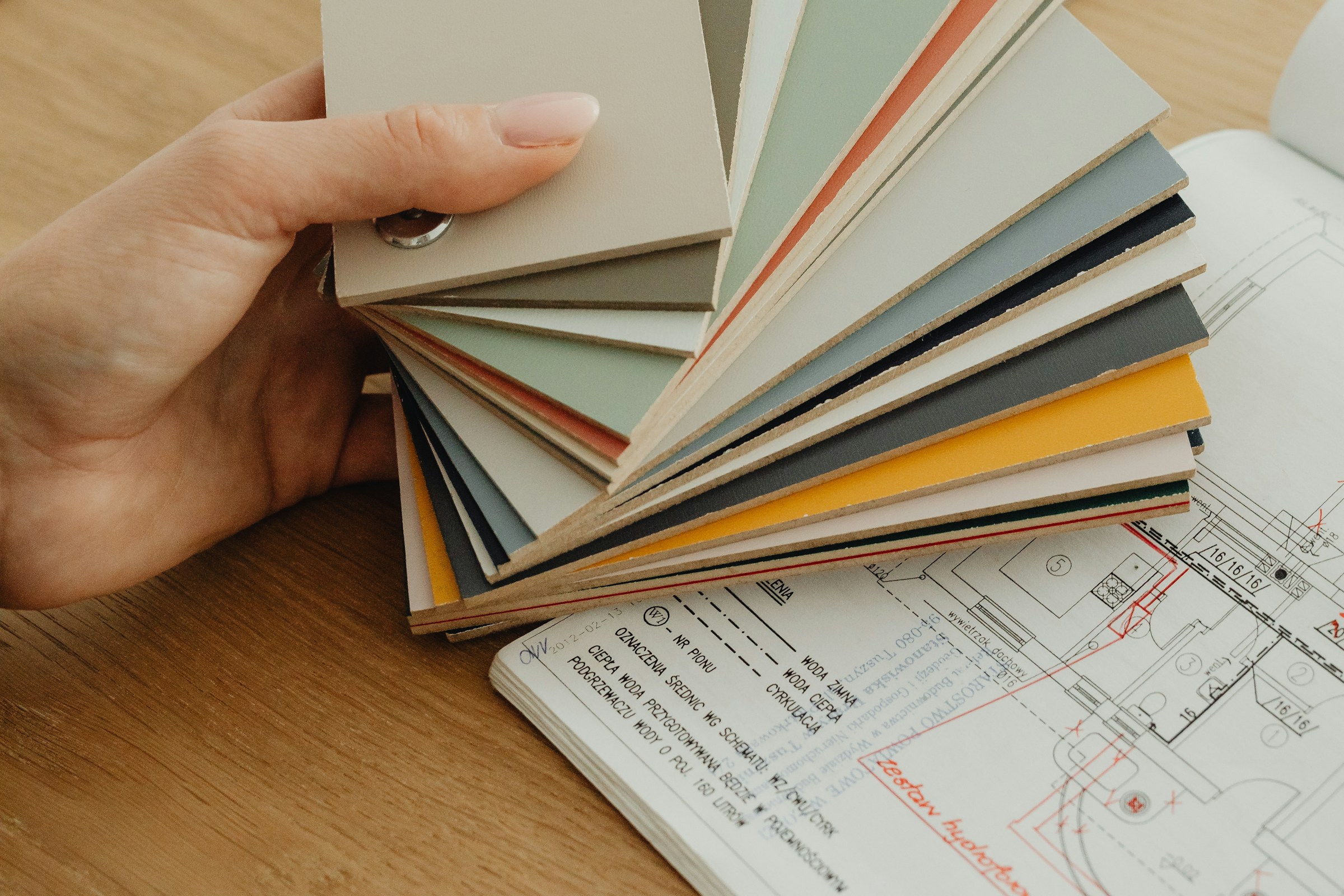
Cover photo — İnci Çınaroğlu / Pexels
Choosing colours for a Moroccan interior is not about filling every room with terracotta, Majorelle blue and pattern. A successful palette begins with the room’s real light, responds to its existing materials and gives every hue a clear role.
In this practical guide, Mr Mine Deco in Marrakech explains how to build a warm, coherent and durable palette for a contemporary apartment, villa or riad—from the first sample to the final lighting check.
Before colour: start with the room, not the swatch
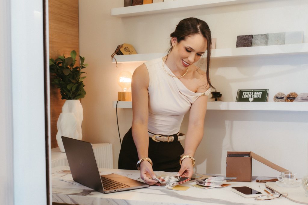
A colour that looks perfect on a screen can fail on a wall. Begin by listing the elements that are difficult or expensive to change: flooring, stone, zellige, doors, timber ceilings, sofa and main rug. Each has an undertone. A beige may lean yellow, pink, grey or green; two opposing beiges can make one another look unexpectedly dull.
Define the atmosphere in three words
Write three words before selecting three colours. “Bright, natural, calm” might lead to off-white, sand and sage. “Intimate, enveloping, sophisticated” may suggest khaki, walnut and aged brass. This short intention becomes a filter for paint, textiles and accessories and prevents impulsive purchases.
Account for use and sight lines
A reception room can carry more contrast than a bedroom. A working kitchen needs finishes that tolerate cleaning. In an open plan, every colour must also work from the neighbouring space. Intensities can change from room to room, but one repeated neutral, timber or metal creates continuity.
How Moroccan light changes colour
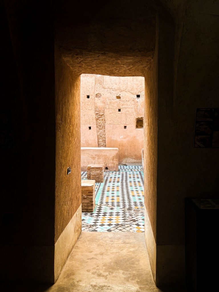
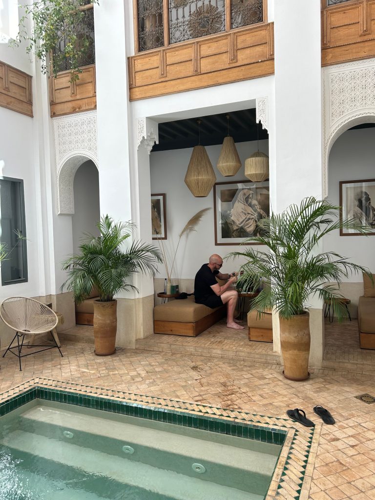
Marrakech often delivers strong, warm daylight. It amplifies ochres, terracotta and cream, yet can make yellow or orange much brighter than expected. A riad behaves differently: rooms facing a courtyard may receive indirect, cooler and rapidly changing light. The only reliable approach is to evaluate each room on its own.
| Orientation or setting | Typical effect | Reliable starting points | Watch for |
|---|---|---|---|
| South | Abundant warm light | Off-white, sand, sage, greyed blue | Yellow and orange becoming too intense |
| West | Golden late-afternoon light | Muted terracotta, khaki, pink beige | Judge the room when it is used most |
| East | Clear morning light | Linen, cream, soft green, smoky blue | A base that feels too cold later |
| North | Diffuse, cooler light | Warm ivory, warm greige, pale clay | Cold greys looking flat |
| Courtyard or shaded room | Indirect light and strong contrast | Luminous neutrals or deliberately deep tones | Pure white turning grey |
Artificial light matters just as much. Around 2700 K feels intimate in a lounge or bedroom; around 3000 K remains warm but clearer for a kitchen or bathroom. Test the intended lamps with the paint samples. A high colour-rendering quality helps zellige, timber and textiles stay true after sunset.
Five Moroccan colour families worth reinterpreting
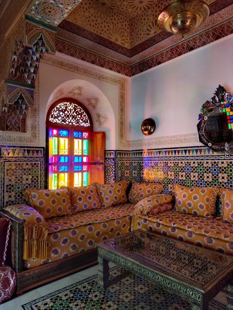
Morocco offers a remarkable chromatic heritage: the clay-pink ramparts of Marrakech, the ochres of southern kasbahs, Chefchaouen blues, zellige greens and the deep reds of Atlas rugs. Contemporary design does not need all of them at once. Choose one reference and translate it with restraint.
Warm neutrals—the most versatile base
Off-white, ivory, linen, sand and warm greige reflect light and let texture breathe. They are ideal for walls, large curtains and sofas. Avoid flatness by mixing matte tadelakt, slubby linen, looped wool and visible timber grain within the same tonal family.
Terracotta and ochre—the warmth of the South
Clay, brick, muted terracotta, saffron and red ochre add identity quickly. In a contemporary room, use them on a niche, one wall, a rug or selected cushions. They sit naturally beside walnut, saddle leather, raffia, linen and aged brass.
Greens—a connection to gardens
Sage, olive, khaki, bottle green and emerald recall planted patios and the Atlas landscape. Sage feels expansive and restful; a deeper green makes joinery, a bookcase or a headboard more enveloping. Timber and brass turn it quietly luxurious.
Blues—air and depth
Smoky blue, teal, turquoise and Majorelle blue make decisive accents. An intense blue is powerful on a door, inside a niche or in a zellige pattern. For a calmer full wall, choose a greyer blue that changes softly with daylight.
Brown, black and metal—structure without weight
Cocoa, charcoal, bronze, copper and aged gold give pale palettes rhythm. Repeat them as fine lines—handles, frames, lamp stems, table bases or piping. Two or three echoes are enough to connect the room.
The 60/30/10 rule: an easy visual balance
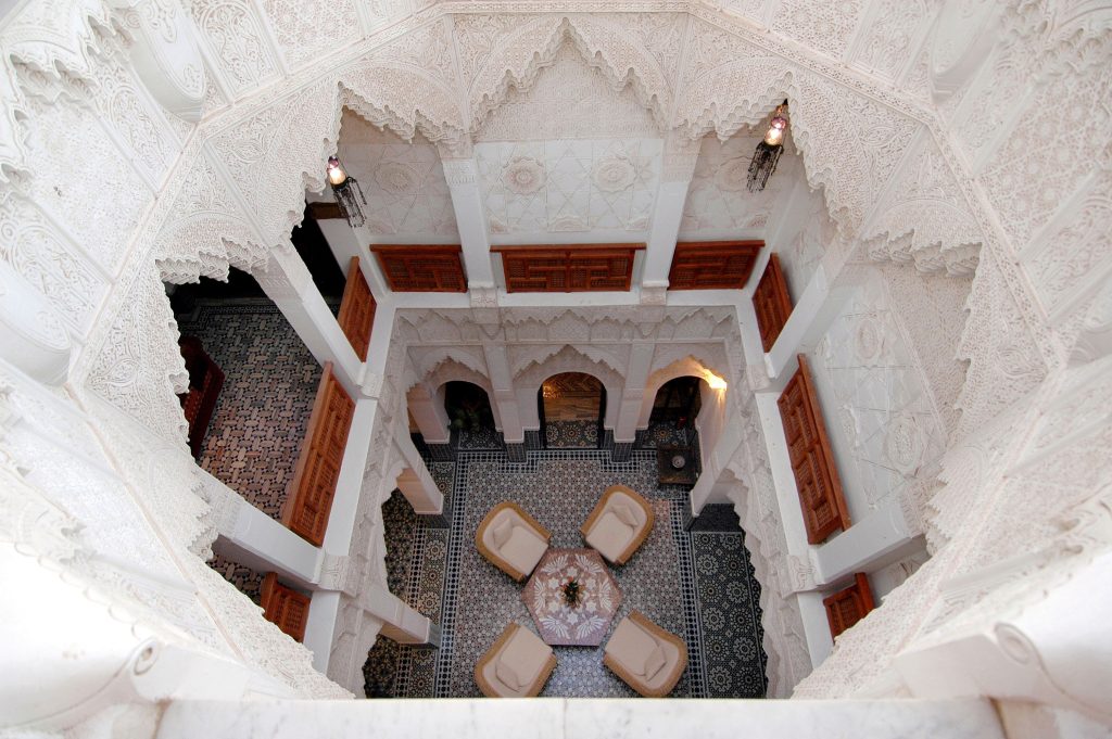
- 60% dominant colour: walls, large curtains, a major sofa or a visually present floor.
- 30% secondary colour: rug, armchairs, headboard, joinery or one accent wall.
- 10% accent: cushions, ceramics, artwork, plants and small metallic details.
Example for a living room: ivory walls and a cream sofa form the 60%; a terracotta rug and walnut table make up the 30%; olive cushions and a brass lamp provide the final 10%. Materials count as colours—timber can be the secondary tone and metal the accent.
Six Moroccan palettes ready to adapt
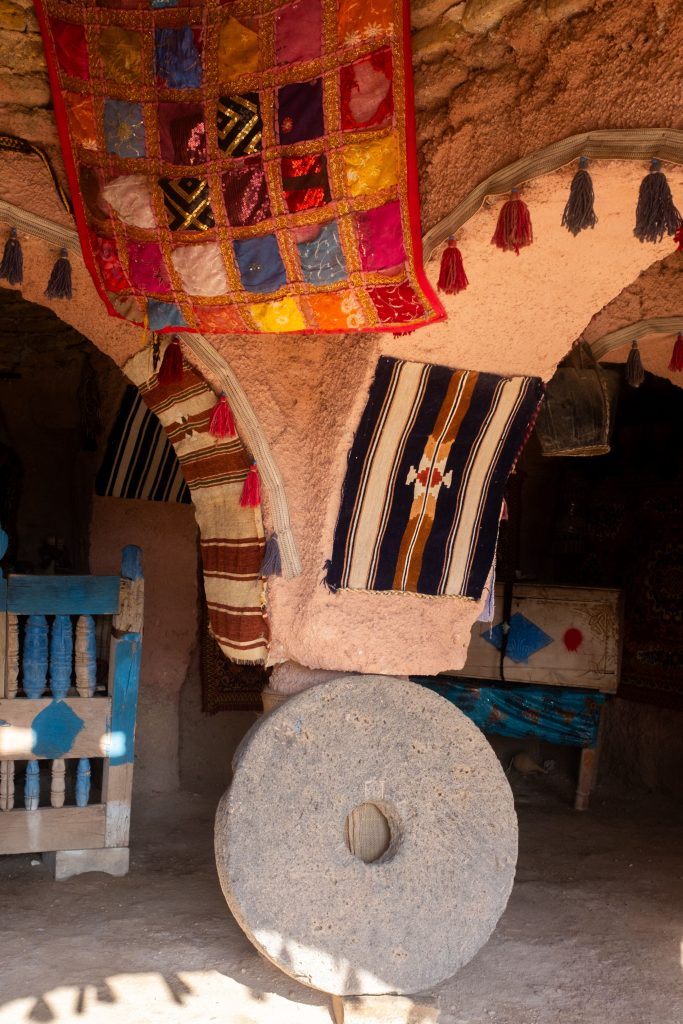
The colour codes below are screen references, not paint specifications. Substrate, finish and daylight change the result. Keep the structure, then replace only one hue at a time to suit an existing rug, stone or timber.
Palette 01
Marrakech Natural
- Warm ivory#F0E5D2 · 60%
- Terracotta#B96546 · 30%
- Olive#697047 · 10%
Bright living room, villa or contemporary riad
Palette 02
Sophisticated Garden
- Linen#E9E0D0 · 60%
- Khaki green#556451 · 30%
- Aged brass#A77C45 · 10%
Library, living room or principal suite
Palette 03
Soft Chefchaouen
- Shell white#F1ECDF · 60%
- Smoky blue#7DA5B4 · 30%
- Deep blue#34536B · 10%
Bedroom, bathroom or coastal home
Palette 04
Enveloping Atlas
- Sand#D8C7AD · 60%
- Clay brown#704436 · 30%
- Golden ochre#B78945 · 10%
Evening lounge, entrance or dining room
Palette 05
Controlled Majorelle
- Sand greige#E6DAC4 · 60%
- Walnut#6D543D · 30%
- Intense blue#1F3F78 · 10%
Door, niche, office or zellige detail
Palette 06
Graphic Riad
- Warm chalk#EEE6D8 · 60%
- Charcoal#2E2D2A · 30%
- Copper#A96748 · 10%
Entrance, kitchen or contemporary patio
Choosing colours room by room
Living room: create one focal point
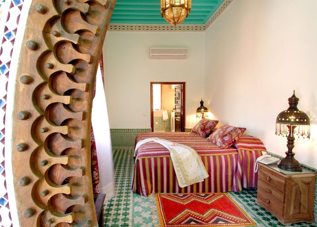
A living room already contains seating, rugs, tables, lamps and objects. A quiet base gives them breathing space. Select one focal point—a terracotta wall, coloured rug, green sofa or blue niche—and ask every other element to support it. Repeat the accent in three separated places rather than concentrating it on one sofa.
Bedroom: lower the contrast
Medium, slightly greyed colours usually rest the eye better than very pure hues. Ivory, sage, pink clay, smoky blue and natural timber make reliable bases. Place the enveloping shade behind the bed and keep the view opposite calm. Tonal curtains can soften the boundaries of a small room.
Kitchen and dining room: link the finishes
Start with the worktop, floor and splashback. Beige stone with off-white zellige can support olive, walnut or greige fronts. If the splashback has strong variation, keep cabinetry quieter. Brass, bronze or black handles can become the accent and repeat in pendants.
Bathroom: let material lead
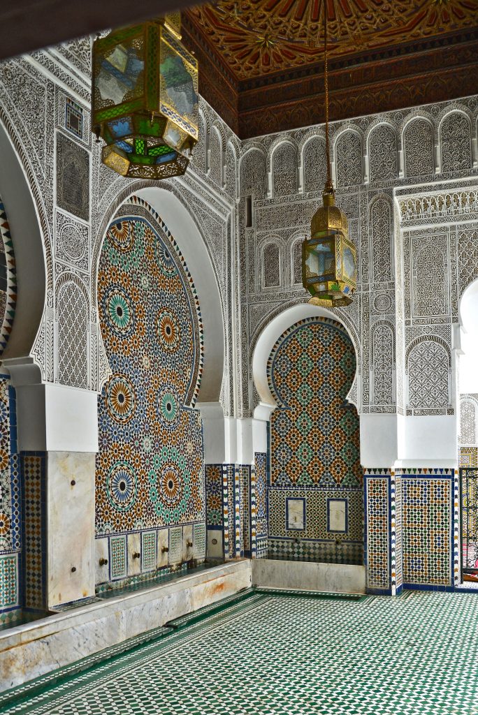
Tadelakt and zellige are never perfectly uniform—that is their strength. Pair them with a calm paint that repeats one undertone. Blue-green zellige is enhanced by warm off-white, medium timber and patinated metal. In a windowless bathroom, an intentional deep green or dark clay can feel more convincing than a white that turns grey.
Small or dark rooms: white is not the only answer
White does not create light; it reflects the light that exists. Warm ivory, pale sand or one enveloping mid-tone often brings more depth to a shaded room. Reduce visual breaks by keeping walls, joinery, curtains and tall storage close in tone.
Pairing colour with Moroccan materials
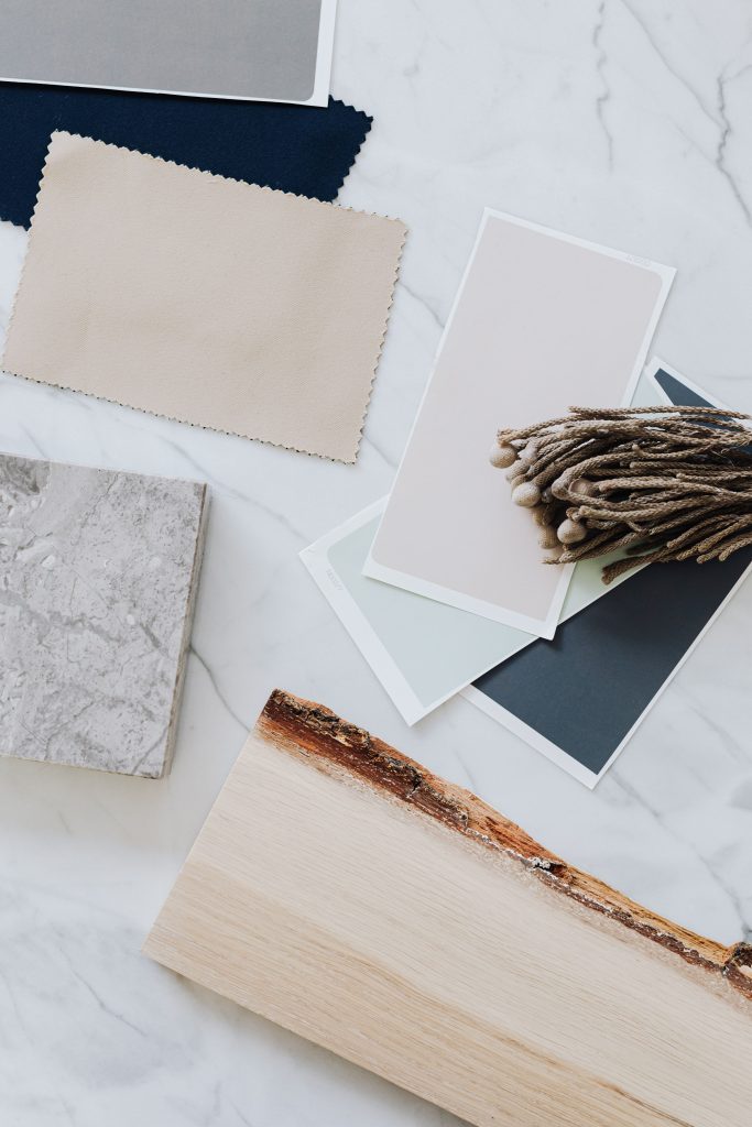
| Material | Harmonious partners | Watch for |
|---|---|---|
| Zellige | A neutral that repeats one tile undertone, timber, patinated metal | Several competing patterns nearby |
| Tadelakt | Linen, matte stone, walnut, copper or aged brass | Its texture shifts colour with the light |
| Cedar or walnut | Ivory, sage, smoky blue, clay and deep green | An overly orange beige beside warm timber |
| Travertine or beige stone | Warm chalk, olive, muted terracotta, brown | Whether the stone leans pink or yellow |
| Brass and copper | Green, deep blue, terracotta, black, warm neutral | Too many unrelated metal finishes |
| Patterned Moroccan rug | Quiet walls and one repeated rug colour | Remember that the rug counts within 60/30/10 |
How to test before painting the whole room
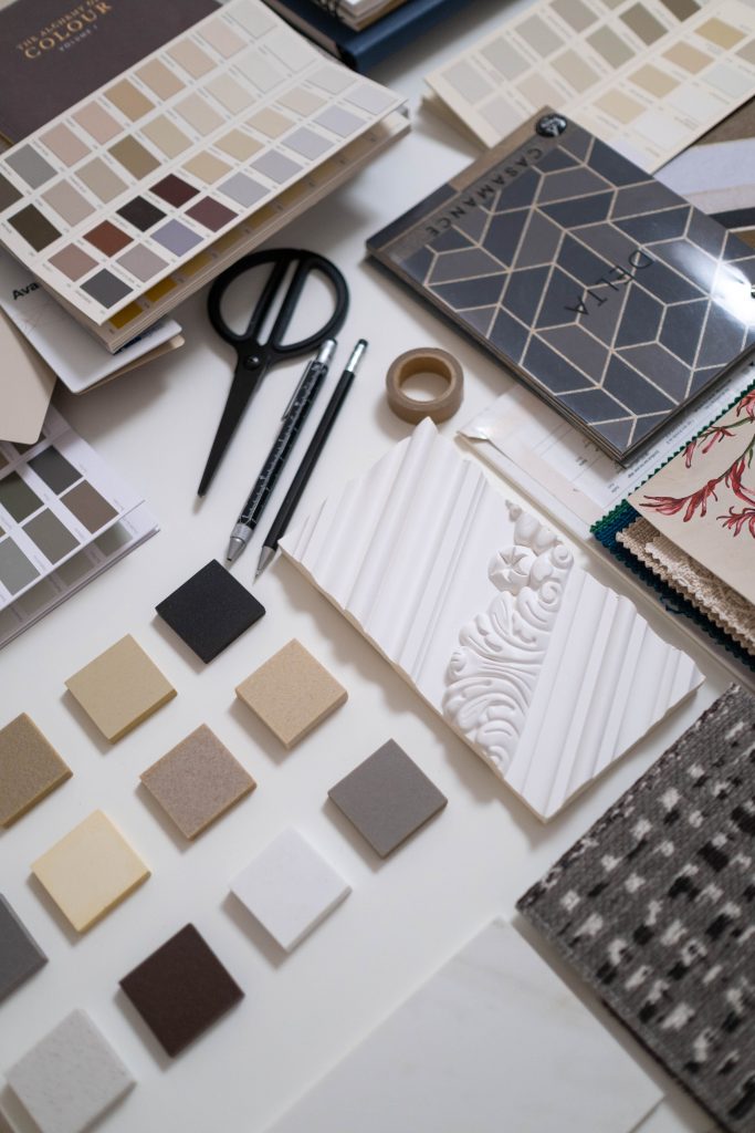
- Shortlist three options maximum. Beyond that, subtle differences become difficult to compare.
- Use the actual paint and finish. A printed chip or screen is not enough.
- Apply two coats to a large board or at least a 50 × 50 cm area, with white space between samples.
- Move the board. Check it beside the window, in a corner, behind the sofa and next to the floor.
- Observe for 48 hours. Morning, midday, sunset and evening lamps expose different undertones.
- Add the materials. View the sofa fabric, timber, zellige, stone and metal together.
- Approve it in the darkest room. A colour that works there is more likely to work throughout the project.
Record the brand, reference, finish and batch; confirm the undertone beside the floor and joinery; and check that the palette remains coherent from neighbouring rooms.
Seven mistakes that unbalance a Moroccan interior
- Choosing paint before the floor or rug.
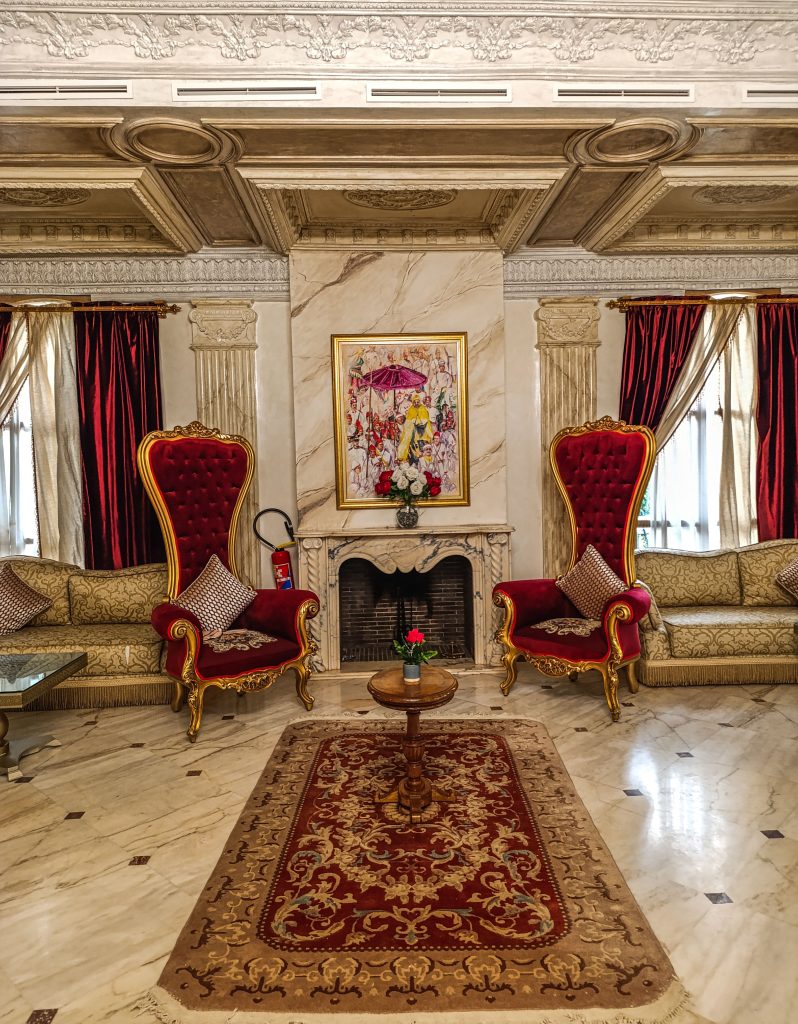
- Using every iconic Moroccan colour in one room.
- Confusing visual richness with accumulation.
- Defaulting to pure white in indirect light.
- Judging colour from a tiny swatch.
- Ignoring the ceiling and joinery.
- Changing colour, material and pattern at the same time when correcting the scheme.
Frequently asked questions
What colours work with terracotta?
Terracotta sits easily with ivory, sand, olive, natural timber and aged brass. For a calm result use two neighbouring neutrals; for contrast, introduce a very small amount of deep blue.
Can Majorelle blue work in a small room?
Yes. Decide whether it is an accent or a full atmosphere. Use it on a door, niche or selected zellige as an accent; for a full room, balance it with a warm ceiling, textiles and layered lighting.
Which colour makes a Moroccan living room feel larger?
Low-contrast light tones—ivory, linen, sand and warm greige—help boundaries recede. Keep walls, curtains and large seating close in tone and place stronger contrast at one focal point.
Must the ceiling be white?
No. A lighter version of the wall colour softens the transition. In a tall room, a slightly deeper ceiling can make the volume more intimate. Carved or painted timber already acts as a major colour.
How do I mix Moroccan patterns?
Keep one colour in common and vary scale: a large motif on the rug, medium pattern on a cushion and near-solid texture elsewhere. Two equally detailed patterns compete more easily.
Can a dark colour work in a dim room?
Yes. A dark hue can create an enveloping room rather than an unpleasant one. Add several light sources, tactile materials and a few pale surfaces to structure it.
How many colours should one home use?
A coherent base of three to five hues is usually enough, used at different intensities. Repeat the same off-white, timber or metal, then allow each room one individual accent.
A palette that truly belongs to its setting
The best palette is not a shopping list. It reveals daylight, proportions, craft and everyday life. Start with what is fixed, build a clear hierarchy and allow time for testing. Coherence—not the number of colours—is what makes a contemporary Moroccan interior feel both alive and elegant.
Choosing between several palettes?
Mr Mine Deco creates personalised colour studies and complete interior design projects in Marrakech and across Morocco, coordinating paint, materials, furniture, lighting and textiles around your real space.
Continue reading
The logical next step
The matching service and case studies
This guide comes out of our daily work. Here is the service it relates to, and two case studies that show it in practice.


